
CUSTOMIZATION GUIDE · BRICKS 2.4.5
Make the colors
and fonts yours.
Give a kit your own identity with Bricks’ native color and typography controls. Follow real editor screenshots, understand what each edit affects, and keep the finished website comfortable to read.
Screenshots checked November 8, 2026. The AUREL kit is used for the examples; labels and styling sources can differ between kits.
Start with the kit you have.
Import the kit into your own WordPress website with a licensed Bricks theme. Take a backup or use a staging copy before changing shared styles. Open the kit overview’s Design details to note its color roles, HEX values, font families and weights.
01 · KNOW WHAT WILL CHANGE
Find the source of the style.
One element
An element ID, such as the heading shown in the screenshots, controls that element. Choose this for an intentional exception.
A shared pattern
An active global class updates elements that use that class. Check the selector above the Content and Style tabs before editing; the class may be used on other pages or kits.
A site default
Theme Styles provide defaults where their conditions apply. Existing element, class or section font settings can take precedence, so a default font change may not alter every imported layout.
02 · COLORS
Change the palette with purpose.
Open the palette
Every current kit includes a color palette named for that kit. In the builder toolbar, open Styles → Colors and select your kit’s name. The screenshot shows AUREL.
Match the role
Compare the kit’s Design details with the palette. In AUREL, paper is the canvas, ink is text, quiet is a surface, and accent is the champagne detail. These names describe their job; the canvas can be dark.
Edit the color value
Use the color’s edit control or HEX field to enter your replacement value. Keep the variable name intact when you want existing references to keep working. Change one role at a time and inspect the actual text/background pair.
Save and check connected pages
Save the builder, then check the header, footer, buttons and an inner page. The kit’s connected colors use the named palette. Keep its variable names intact so a color-role change reaches the layouts that reference it.
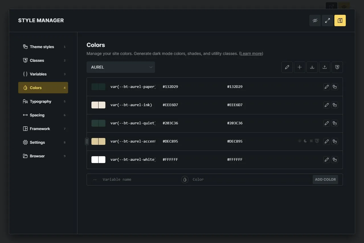
Real Bricks Color Manager: AUREL’s canvas #132D29, text #EEE6D7, surface #203C36, accent #DEC895 and white #FFFFFF. The saved names keep the bt-aurel prefix.
Open full-size Color Manager screenshotPreserve the contrast.
Use each color for a clear role: canvas, text, surface or accent. Keep a readable text/background pair when replacing a value, and check links, buttons and keyboard focus states before saving.
03 · TYPOGRAPHY
Keep the roles.
Choose your own voice.
Headings
- Select a heading in the canvas or Structure panel. Open Style → Typography and check whether the active selector is the element ID or a global class.
- Choose the desired Font family and an available Font weight. The real AUREL heading shown here uses Italiana at 400. Preserve its heading tag: changing appearance does not require changing H1 to another level.
- Keep the existing font-size, line-height and breakpoint rules as a starting point. A different font can wrap sooner, so check the title on a narrow screen before reducing its size.
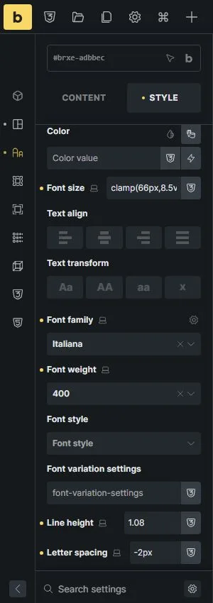
The selected AUREL heading uses Italiana at weight 400. This is an element-level setting.
Open full-size heading controls screenshotBody text
- Select a paragraph and inspect Typography. If the font family is inherited, look at its parent container or section and any applied class. AUREL’s hero paragraph inherits Manrope 400 from its section.
- For a shared change, edit the class or parent that supplies the family. This affects inheriting descendants; headings or buttons with their own font-family value can keep their separate typeface.
- To use Theme Styles as the source, open Styles → Theme styles, choose the intended style, check its conditions and set its typography. Clear only the conflicting family or weight overrides on the elements or sections that should inherit those defaults. Review each page rather than assuming a whole-kit font switch.
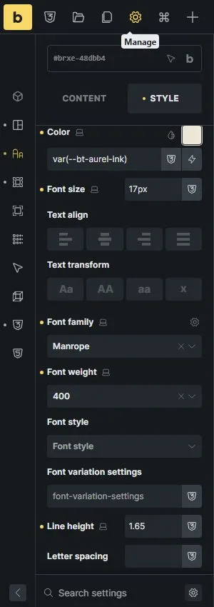
The AUREL hero section supplies Manrope at weight 400 to text that inherits its font family.
Open full-size body-font controls screenshotFor a consistent kit-wide result, review the source of both roles on the pages you import, including the header and footer. Keep intentional exceptions such as labels or display headings.
04 · FONT FILES
Use the family you can actually load.
- Open Font Manager from the control beside Font family. The Browser also lists Font manager under Managers. Look under Custom fonts first; an imported kit may already include its intended family.
- If a file is missing, use the Font Manager’s Add control, enter the family name and add the licensed font variations from your download or font supplier. A WOFF2 file is a compact option. Review each variation’s weight and style, then save the builder.
- Choose that family and the matching weight in Typography. Uploading a family makes it available; it does not apply the font to your pages automatically. Keep the font licence and use only files you have permission to host.
- For a system font, use the standard family option. Visitors may see an installed font or a fallback, so check more than one device. Avoid adding extra families or unused weights just to reproduce a sample.
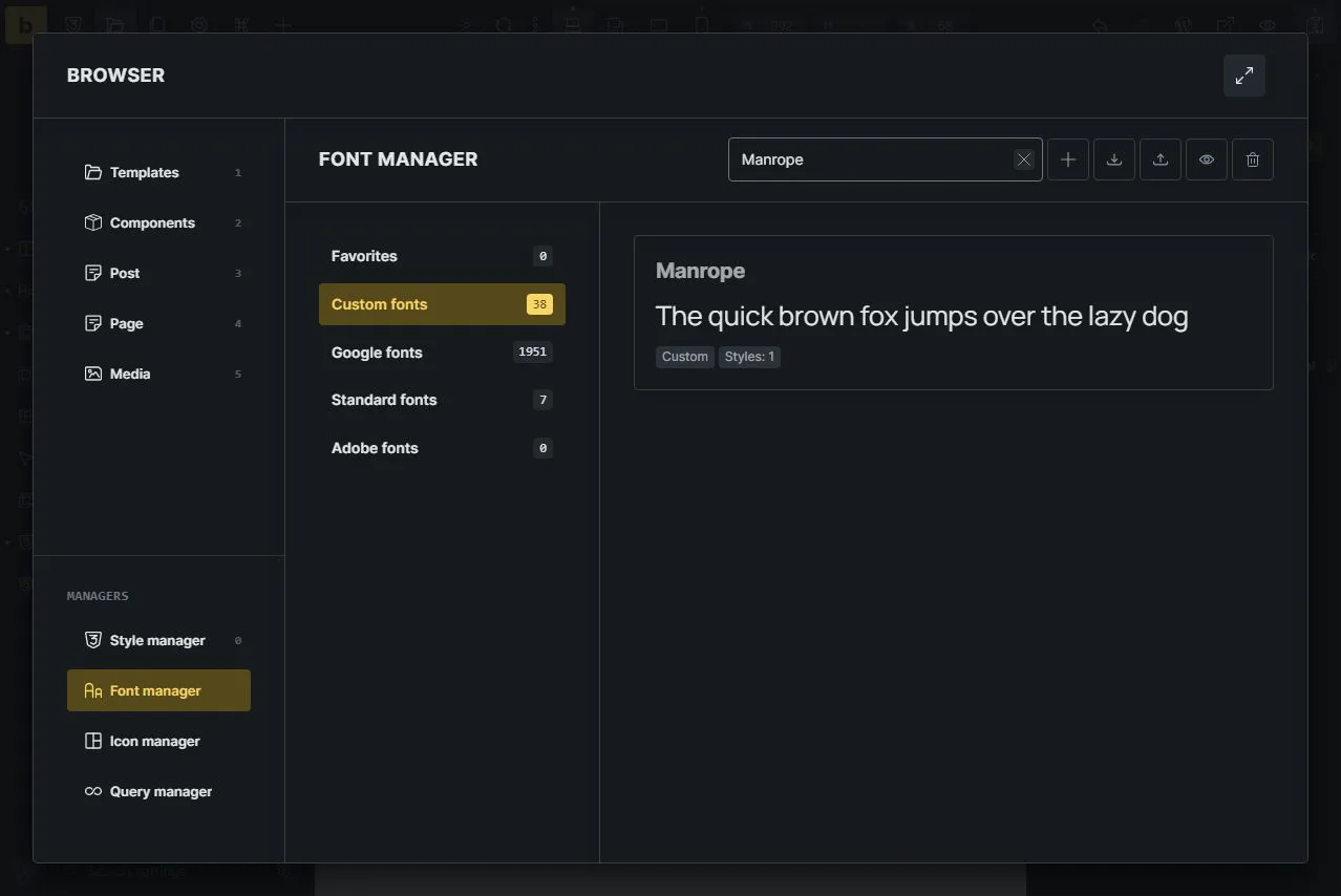
Real Bricks Font Manager: Custom fonts contains the self-hosted Manrope family. The Add control sits beside the search field.
Open full-size Font Manager screenshot05 · CHECK THE RESULT
A good-looking change
should still be easy to use.
Read the color pair
Check actual text against its background, including buttons, links, form hints and text over photos. Aim for at least 4.5:1 for normal text; WCAG allows 3:1 for qualifying large text. Pale accents often work better as decoration than small text.
Keep links recognizable
Retain underlines or another clear visual cue and a visible keyboard focus indicator. Check hover and focus states after a palette change. Meaning and errors should not depend on color alone.
Check small screens and zoom
Use the Bricks breakpoint controls, then open the frontend at a narrow width and at 200% browser zoom. Look for clipped titles, horizontal scrolling, cramped labels and long navigation items. Check body copy, not just the hero.
Check the complete set
Review a service page, people or project page, contact form, FAQ, header and footer. Save your edits and test the frontend outside the builder. Recheck readability after changing the actual business copy.
When the change does not show.
My color changed here, but not elsewhere.
Check whether the unchanged control references the palette color or holds an independent value. Inspect its active class, selector and breakpoint. Update the intended shared source, or deliberately replace the local value.
The font is installed, but the page still looks the same.
Set the family in Typography, confirm the required weight exists, and check for a more specific element or class setting. Theme Style defaults do not replace every explicit kit setting.
A heading or menu now wraps badly.
Compare the desktop and mobile settings. Adjust only the relevant size, line-height or spacing, and keep the wording readable. Do not shrink every paragraph to compensate for one long title.
If the saved frontend still differs from the editor after checking the styling source, clear the relevant page/browser cache and refresh. Use a backup or a revision for a page edit; page revisions alone may not restore every global palette, class or font change.
A starting point.
Your point of view.
Choose a kit, keep its useful page structure, and make a considered color and type change. The Design details link in each preview toolbar takes you back to the kit’s palette and font information.
Explore the template libraryGet help with a kit